Intro: The Deceptive Simplicity of <img>
We’ve all been there: you drop a standard <img /> tag into your HTML, and it looks fine on your high-speed fiber connection and 27-inch monitor. But as soon as you throttle the speed or shrink the viewport, the “simple” image tag starts to fail. It causes layout jumps, eats up mobile data, and creates a clunky, unpolished user experience.
Optimizing images isn’t just about compression; it’s about how the browser handles the space before, during, and after the asset loads. In Part 1 of this series, we’re going to look at the evolution of the image tag – from the “raw” implementation that breaks layouts to the “Ultimate Solution” that leverages modern APIs for a buttery-smooth, high-performance UI.
The Standard Image Tag
Enter the standard image tag. The standard tag has no real frills and will inevitably have a few issues on its own.
Here are a few:
- The image will not be responsive. It will not scale to the container width (without global styles to limit the width and height).
- The image will not be lazy loaded. It will be loaded immediately, causing a slower page rendering experience.
- The image will cause a reflow when it is loaded. This is because browser initially has no measure of how much space the image needs in the layout. It can only calculate this after the image is fetched.
<img src="butterfly-1000x1000.webp" alt="Butterfly">
Using an Explicit Size to Eliminate Redraws
By providing explicit width and height attributes (e.g., <img src="..." height="1000">), the browser allocates a placeholder box with the correct proportions immediately. Even before a single pixel of the image is downloaded, the content below it stays exactly where it belongs.
Unfortunately, if we don’t want our images to burst out of their containers if the container is too small, we’ll need a max-width attribute, which can cause the images to skew out of proportion as the height tries to stay the same.
img {
    max-width: 100%;
}
<div class="row">
<div class="col">
<img src="deer-1000x1000.webp" alt="Deer">
</div>
<div class="col">
<img src="deer-1000x1000.webp" alt="Deer">
<h4>Content</h4>
<p>This content will start higher, then shift down the page as the image dimensions are determined.</p>
</div>
<div class="col">
<img src="deer-1000x1000.webp" alt="Deer">
</div>
</div>
Content
This content will initially appear on the page as it should since the images have explicit height set, but the images will be distorted due to the conflict between explicit height and max-width.
Fixing the Distortion with Aspect Ratios
Aspect ratios can be added to the images to maintain proper dimensions when the image is squashed in a container. This is the same effect as using max-width: 100% and height: auto. The browser will internally calculate the aspect ratio if height: auto is applied. The code below is just for illustrative purposes.
<div class="row">
    <div class="col">
        <img src="bear-1000x1000.webp"  style="aspect-ratio: 1/1;" alt="Bear">
    </div>
    <div class="col">
        <img src="bear-1000x1000.webp" style="aspect-ratio: 1/1;" alt="Bear">
        <h4>Content</h4>
        <p>This content will start in the appropriate spot with no content reflow.</p>
    </div>
    <div class="col">
        <img src="bear-1000x1000.webp" style="aspect-ratio: 1/1;" alt="Bear">
    </div>
</div>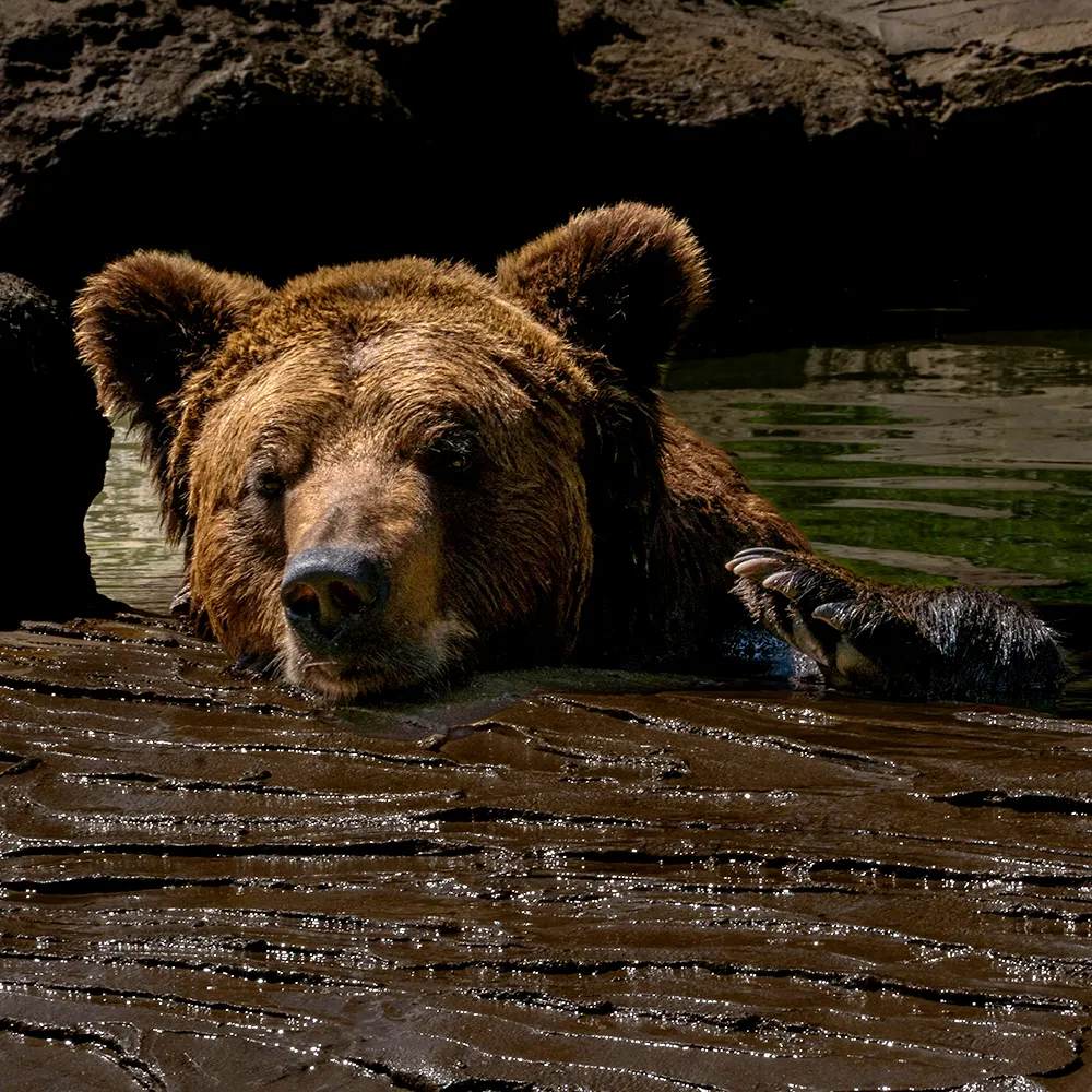
Content
This content will initially appear on the page as it should since the images have explicit size and ratios set.
Speeding up Page Loads with Lazy Images
Adding a loading="lazy" attribute to the image tag will tell the browser that its free to load the image later. Assuming we add the global max-width: 100% and height: auto, we won’t need that explicitly on the image tag, so we’ve fixed that here too. However, the image will still load in chunks, which isn’t stylistically ideal.
<img src="bird-1000x1000.webp" alt="Bird" loading="lazy">
Responsive Image Wrapper
A responsive image wrapper can be used to ensure the image maintains its original aspect ratio, but also allows for “cropping” on the fly by defining the aspect ratio of the container.
...

.responsive-container {
    position: relative;
    width: 100%;
    aspect-ratio: 16 / 9;
    overflow: hidden;
}
.responsive-inner {
    position: absolute;
    top: 0;
    left: 0;
    width: 100%;
    height: 100%;
}
.responsive-inner img {
    position: relative;
    width: 100%;
    height: 100%;
    object-fit: cover;
    z-index: 1;
}
<div class="responsive-container" style="aspect-ratio: 16 / 9;">
<div class="responsive-inner">
<img src="fox-1000x1000.webp" alt="Fox" loading="lazy">
</div>
</div>
Responsive, Lazy & Transitioned
Native lazy loading is a huge win for performance, but it’s a binary switch. The image is either hidden or it’s popping into existence in chunks as the data arrives. To get that soft ‘fade-in’ or a blurred placeholder, we have to move beyond the native attribute and into the world of Intersection Observers.
Here we’ve used both a responsive image wrapper and we’re relying on JavaScript to load the image when it comes into view (in tandem with a small JS function and some CSS). This solves the stylistic loading.
...

.responsive-container.lazy .responsive-inner img {
    opacity: 0;
    transform: translateY(10px);
    transition: opacity 0.3s ease-in-out, transform 0.3s ease-in-out;
}
.responsive-container.lazy .responsive-inner img.loaded {
    opacity: 1;
    transform: translateY(0);
}
.responsive-container.lazy .responsive-inner::before {
    content: '';
    position: absolute;
    top: 50%;
    left: 50%;
    width: 2.5rem;
    height: 2.5rem;
    border: 3px solid rgba(0, 0, 0, 0.12);
    border-top-color: rgba(0, 0, 0, 0.55);
    border-radius: 50%;
    transform: translate(-50%, -50%);
    animation: responsive-inner-spin 0.75s linear infinite;
    z-index: 2;
    pointer-events: none;
    transition: opacity 0.3s ease-in-out;
}
.responsive-container.lazy .responsive-inner:has(img.loaded)::before {
    opacity: 0;
}
@keyframes responsive-inner-spin {
    to {
        transform: translate(-50%, -50%) rotate(360deg);
    }
}
<div class="responsive-container lazy" style="aspect-ratio: 1 / 1;">
<div class="responsive-inner">
<img src="data:image/gif;base64,R0lGODlhAQABAIAAAAAAAP///yH5BAEAAAAALAAAAAABAAEAAAIBRAA7" data-src="beaver-1000x1000.webp" alt="Beaver">
</div>
</div>const images = document.querySelectorAll('img[data-src]');
const observer = new IntersectionObserver((entries) => {
entries.forEach(entry => {
if (!entry.isIntersecting) return;
const img = entry.target;
const url = img.dataset.src;
if (!url ) return;
const finish = () => {
img.classList.add('loaded');
img.onload = null;
img.onerror = null;
};
img.onload = finish;
img.onerror = finish;
if (url) {
img.removeAttribute('data-src');
img.src = url;
}
observer.unobserve(img);
});
});
images.forEach(img => {
observer.observe(img);
});
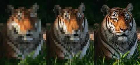
The Ultimate Solution
For the ultimate solution we’ll use the same lazy shell as above, but the real file is chosen with srcset (candidates at several pixel widths) and sizes (how wide the image displays). The browser picks a variant using that plus DPR. The transparent src stays until intersection; then script copies data-srcset / data-sizes onto the element so large assets are not requested early.
By combining srcset with our CSS wrapper, we achieve the holy grail: the browser downloads the smallest possible file for the current screen size, the aspect-ratio prevents layout shifts, and the object-fit: cover ensures that our images fill their containers beautifully without being stretched – regardless of the art direction.
<div class="responsive-container lazy" style="aspect-ratio: 1 / 1;">
    <div class="responsive-inner">
        <img
            src="data:image/gif;base64,R0lGODlhAQABAIAAAAAAAP///yH5BAEAAAAALAAAAAABAAEAAAIBRAA7" data-srcset="tiger-350x350.webp 350w, tiger-500x500.webp 500w, tiger-1000x1000.webp 1000w, tiger-2000x2000.webp 2000w" data-sizes="100vw" alt="Tiger">
    </div>
</div>
const images = document.querySelectorAll('img[data-src], img[data-srcset]');
const observer = new IntersectionObserver((entries) => {
entries.forEach(entry => {
if (!entry.isIntersecting) return;
const img = entry.target;
const url = img.dataset.src;
const srcset = img.dataset.srcset;
const sizes = img.dataset.sizes;
if (!url && !srcset) return;
const finish = () => {
img.classList.add('loaded');
img.onload = null;
img.onerror = null;
};
img.onload = finish;
img.onerror = finish;
if (srcset) {
img.srcset = srcset;
img.removeAttribute('data-srcset');
}
if (sizes) {
img.sizes = sizes;
img.removeAttribute('data-sizes');
}
if (url) {
img.removeAttribute('data-src');
img.src = url;
}
observer.unobserve(img);
});
});
images.forEach(img => {
observer.observe(img);
});
Moving from Manual to Automatic
Building a robust image pipeline manually is a heavy lift, but understanding these mechanics is vital for any front-end developer. We’ve moved from a single, rigid tag to a smart, responsive system that respects user bandwidth and visual stability.
However, manually writing srcset arrays and wrapping every image in a div container is a recipe for burnout – especially in a content-heavy environment like WordPress. In Part 2, we’re going to take everything we just learned and automate it. I’ll show you how to write a PHP filter that hooks into the WordPress media engine to output this “Ultimate Solution” markup automatically.
Leave a Reply